Crafty Ladies Craft Brewery
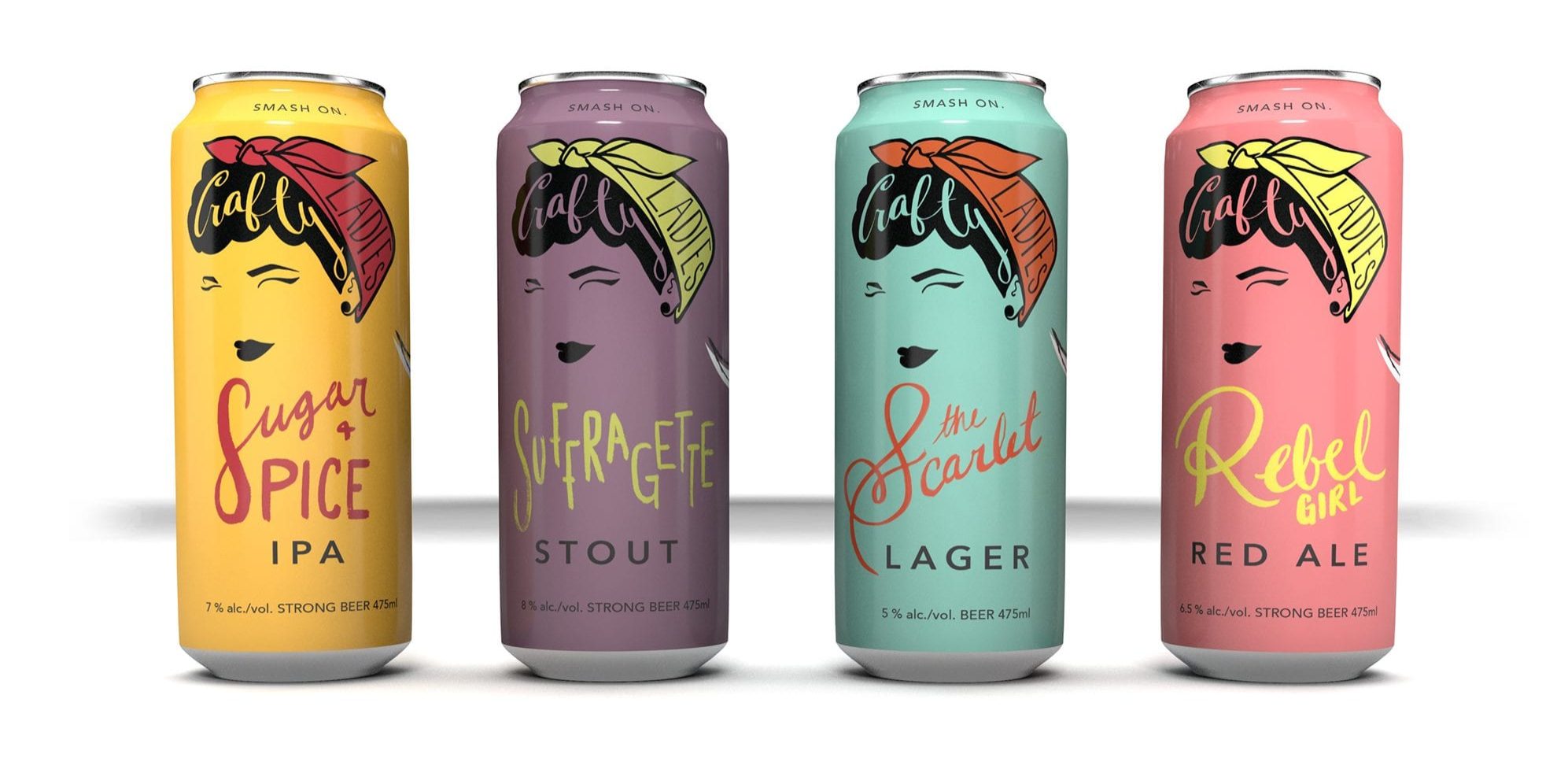
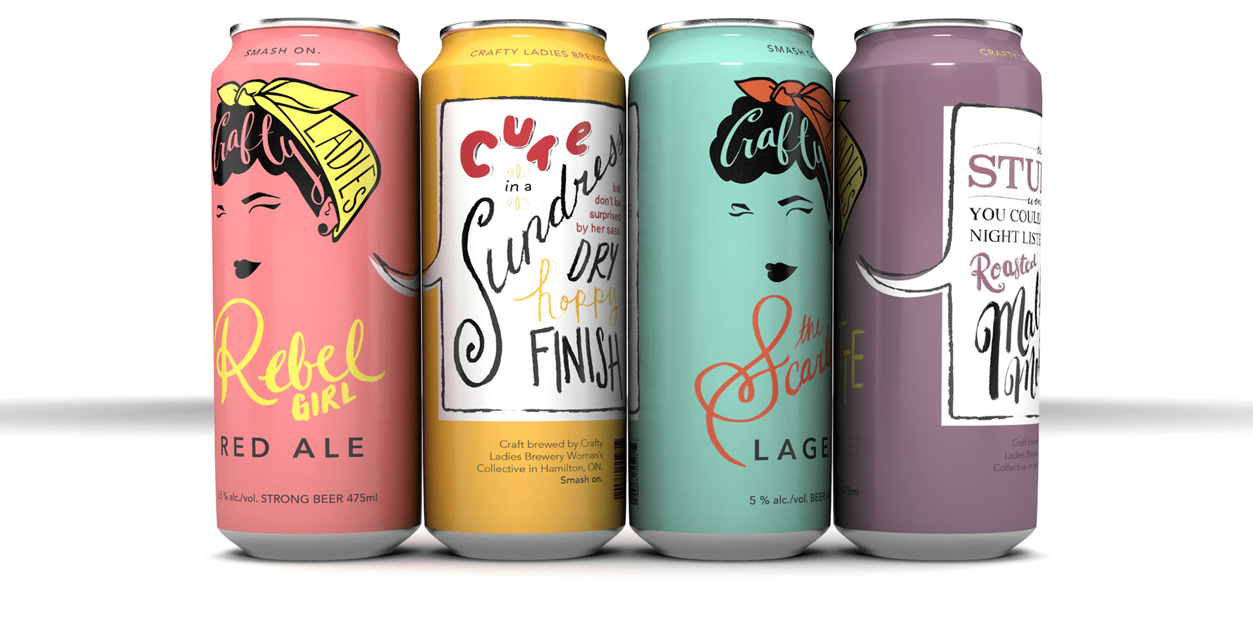
A full branding design developed for a woman's-collective brewery.
Contemporary
girl-power,
vintage vibes.
A full branding design developed for a woman's-collective brewery, Crafty Ladies Craft Brewery .
In this project, I developed the company name, slogan, brew names, and designed their logo, colours, hand lettering typography and label design.
Product design holds so much potential because you can really show off your brand's personality, values and quality through the feel, shape, colours and text. I'm sure your can agree, you'd pay more for the snack or beverage that has colours logos and images that you find attractive, right?

"Hardworking, detailed orientated and always on time. Thank you Kayla for not only your infectious demeanour but also your phenomenal work."
Hired by downtown bicycle shop when they opened shop to create a simple, friendly, old fashioned logo for the town to know them by. The design included elements hand drawn by the owner.
To this project, I brought the typography and overall layout, which reminded me very much of an old fashioned emblem, or stamp.
Simple,
old-fashioned,
friendly.
From your brand logo to packaging, whether your product is on store shelves, or on the shelves of the internet, you want to be the one your potential customer or client feels suits their needs and their aesthetic values.
You're probably also like many other business owners or creators- you are killer at the product or service you provide, but maybe not so savvy with Adobe, colour combos, and file output types. That's okay, that's the beauty of diverse specialization amongst humanity- really high quality things for every niche and need.
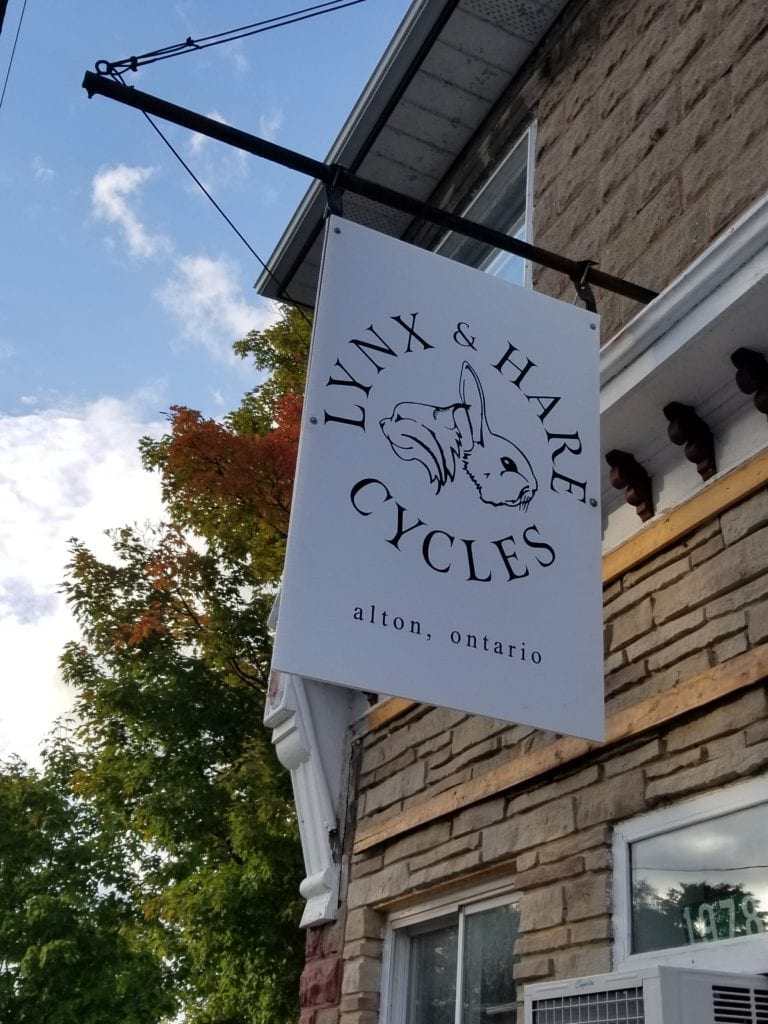
"She took a basic concept I had in mind and turned my rough drawings into a logo that looked the way I'd pictured it but much better. The file she created was easy to use- versatile enough to work as small as a sticker or as large as a 48inch sign for the front of my shop, and made the whole process so easy."
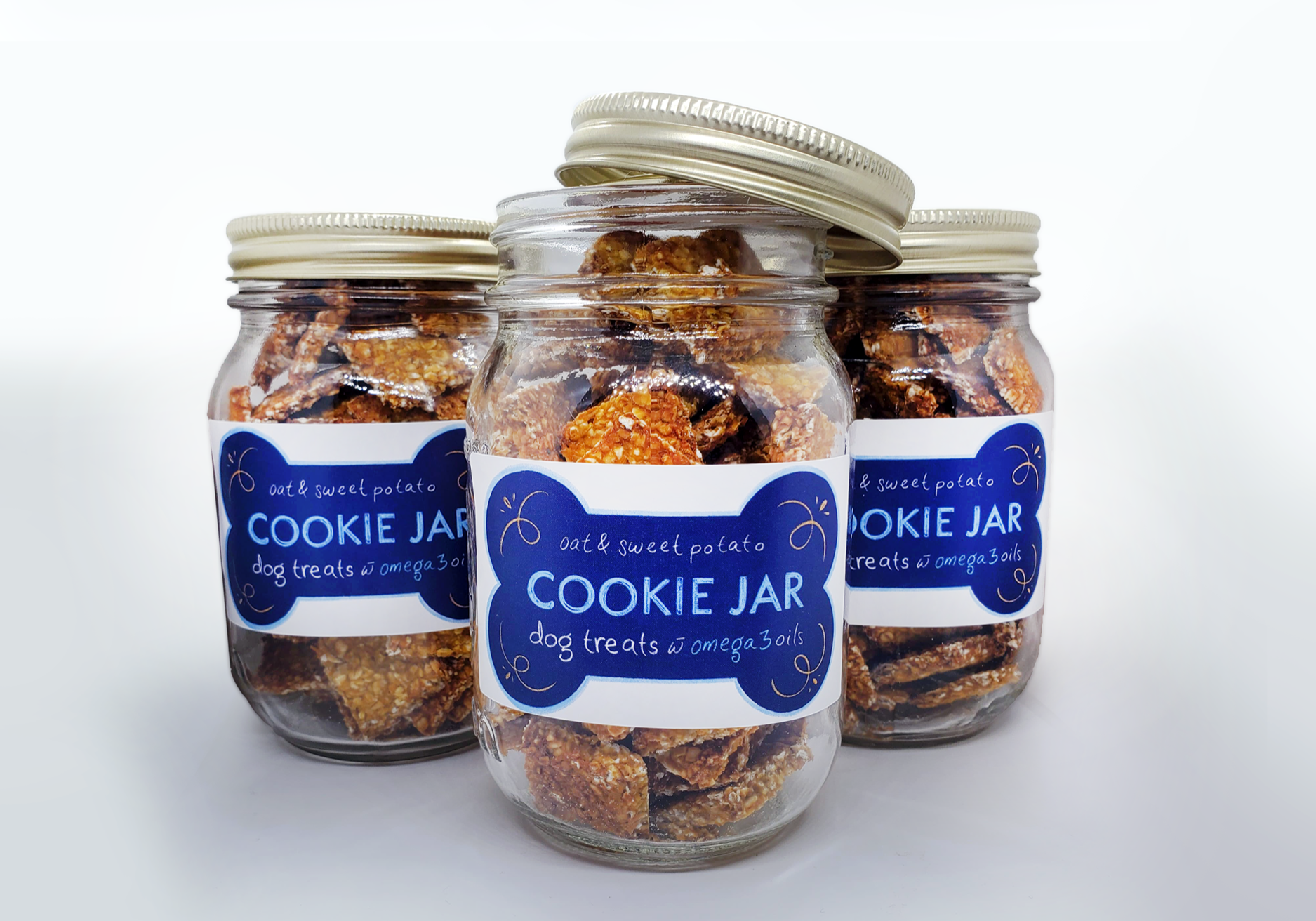
Cookie Jar Dog Treats
Label design for small batch, healthy dog treats.
Make it homey, like jam
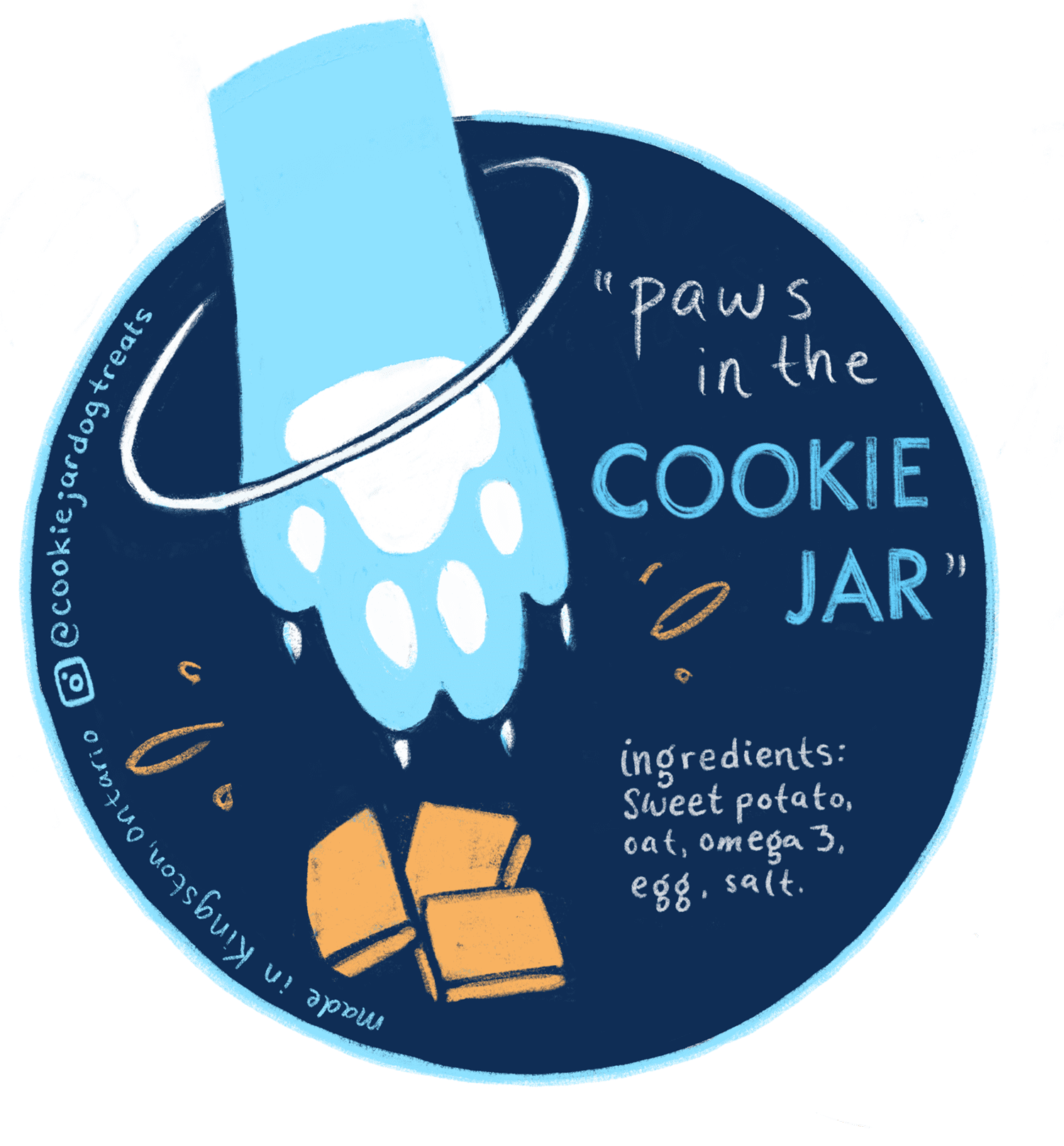
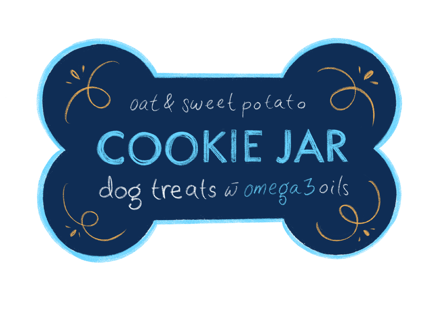
I worked together with the client to make an overall concept for her product that is a healthy, bite size and delicious option for dog training. We decided it would be clever to play with the idea that dog's can't resist a good cookie- and so the business was called Cookie Jar Dog Treats and the slogan "paws in the cookie jar".
I created friendly graphics and entirely hand lettered the labels to give that human touch -the pooches and humans alike can't get enough!
Because they are homemade with a short ingredient list we went with a playful, punchy and somewhat southern inspired colour scheme.
Don't you want to spend your time coming up with other great ways to serve your clients and grow your business?
That's where KayJax Creative Co. comes in.
Think of us as your business and product's 'stylist'- you bring the stuff on the inside and we will make it shine like Beyonce 'woke up like this'.
Check out our graphic design and branding services, and get back to your why, while we take care of the design you and your audience will love.
"She communicates and demonstrates her creative skills impressively . . . What makes her stand out is her incredible enthusiasm and passion for her art and design. Kayla is a joy to work with."
discover the potential of your audience
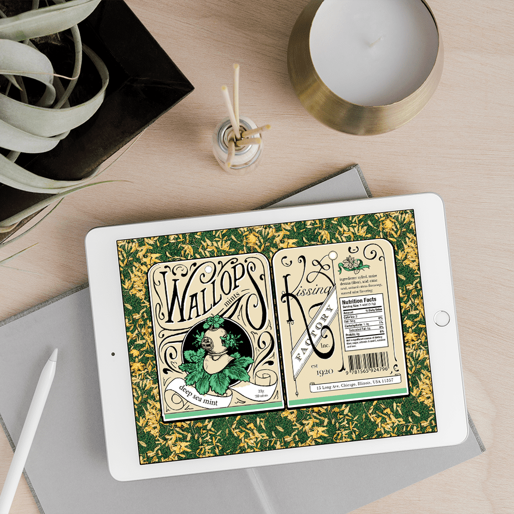
Wallups Mints
Branding and Package Design for the Kissing Factory.
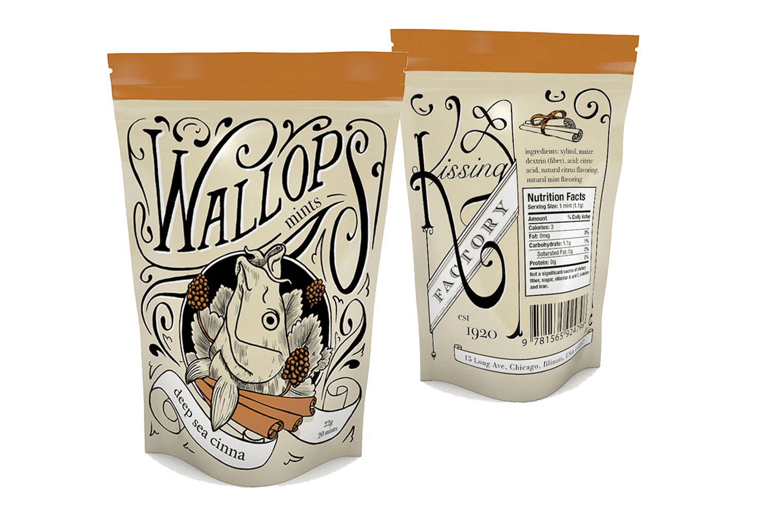
A pair of mint packages designed for a premium mint brand, Wallups. The target audience here was very hipster, lower east side, beards and expensive sunglasses type.
In this project, I developed the flavour names and imagery to match, as well as designing their logo, colours, hand lettering typography and label design.
Developing a brand is a really hands on, creative and dream building process we love going through with our clients.
old style mints
for the modern
hipster.
The look into the branding process:
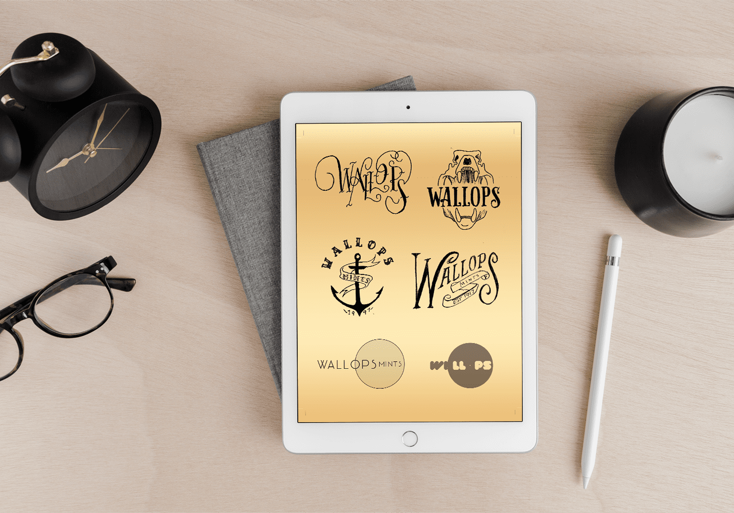
First, we go through a questionnaire, gathering your business' personality, and who your audience is. We then gather visuals that reflect these aspects. This is called, by some, a mood board. At least 3 of the best logo designs and colour schemes will be developed to a good-rough stage from exploring different possibilities of typography and imagery.
Once a favourite is chosen, we develop an alternate logo (commonly known as a submark or monogram) that can be used in different situations and spaces for a perfectly coherent brand image.
A favicon is also made for web browsers, and complimentary typefaces are chosen, at least one for headlines and one body copy (a.k.a. everything else).
And the brand board is complete! From this point it is not only used for the logo, but can be used in combination with the mood board a reference point for every other element of your brand- think stationary, your website, social media and, of course, packaging!
Ready for your wellness ebook, dog walking flyers, or home made toothpaste to look so friendly and professional your dream clients can't help snatching up your product? Schedule a complimentary consult to see how we can help you get there with consistent and stellar branding and package design.
